So for example, to display the chart for a given race we can call an R plotting function of the form:
racePosChart=function(df,race){
ggplot(df) + geom_hline(aes(yintercept=24-missing),size=0.5,colour="gray80") + geom_linerange(aes(ymin=grid,ymax=pos,x=driverNum,group=driverName,color=factor(pchange>0,labels=c("Loss","Gain"))),size=0.6) +geom_point(aes(x=driverNum,y=grid),col="gray50",size=1) + geom_point(aes(x=driverNum,y=pos),colour='gray50',size=1,shape=2) + opts(title=paste("F1 2011 ",race," Position Changes Grid-Final Classification"),axis.text.x=theme_text(angle=-90))+xlab(NULL)+ylab("Position") + scale_colour_discrete(name="Position Delta")+ylim(0,24)
}
with something like:
racePosChart(subset(raceResults2011,race=="MALAYSIA"))
to generate a chart of the form:
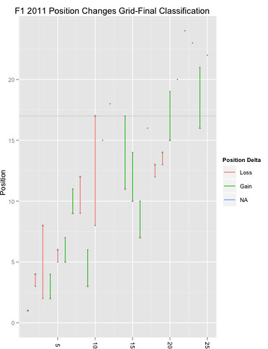
(I tweaked the formula - the race name should also appear in the title. BUT the grid lines arenlt that clear - we really need to add a vertical grid line for each car number as well as adding an x-axis label for each car number.)
And for a plot based around driver, we can use something like:
driverPosChart=function(df){
ggplot(df) + geom_linerange(aes(x=race,ymin=24-missing,ymax=24),colour='gray50') + geom_point(aes(x=race,y=24-missing),colour='gray50',size=1,shape=3) + geom_point(aes(x=race,y=pos),colour='gray50',size=1,shape=2) + geom_linerange(aes(ymin=grid,ymax=pos,x=race,group=driverName,color=factor(pchange>0,labels=c("Loss","Gain"))),size=0.6) + facet_wrap(~driverName)+geom_point(aes(x=race,y=grid),col="gray50",size=1) + opts(title="F1 2011 Position Changes Grid-Final Classification",axis.text.x=theme_text(angle=-90))+xlab(NULL)+ylab("Position") + scale_colour_discrete(name="Position Delta")
}
and a call of the form:
driverPosChart(subset(raceResults2011,driverName=="Adrian Sutil"))
to generate a chart like this:
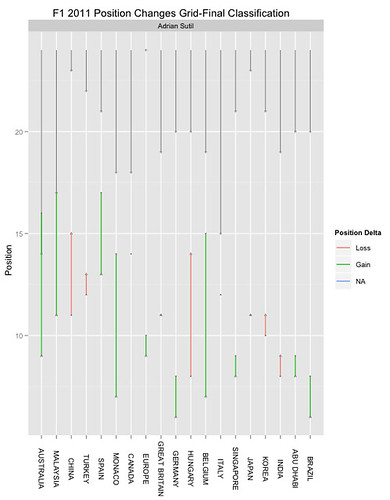
Leaving the facet command in and only passing a single facet value in means that only a single panel is displayed, but the driver name is tastefully rendered in the panel top bar. BUT - the limits are off... The y-range starts at 5, rather than 1, for example. We need to add in something like +ylim(1,24)... I also need to add in grid lines for each race position... Bah:-(
No comments:
Post a Comment
There seem to be a few issues with posting comments. I think you need to preview your comment before you can submit it... Any problems, send me a message on twitter: @psychemedia