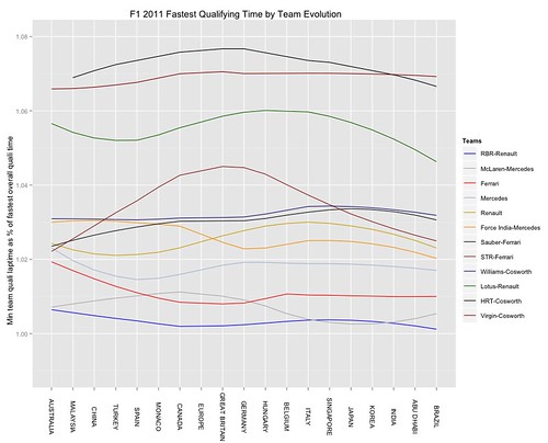
The following chart shows a loess model over the fastest times recorded by both drivers in the team during qualifying by each team over the 2011 season (so in constructing the model, there are two data points per team for each race):
This chart shows a loess model over the fastest time recorded within each team over all qualifying sessions:
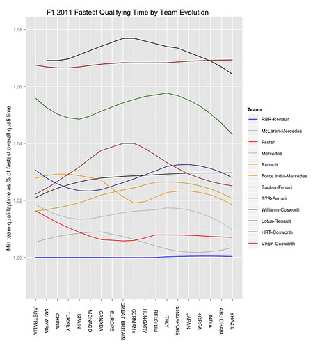
Here's how they were created:
See also: F1 2011 Review - Another Look at Fastest Laptime Evolution
You're quick Tony!
ReplyDeleteIt's funny how the order of the lines at the end of the season matches quite closely to the overall team standings at the end of the year (except the mid-pack)!
@HenningO I just updated the post with another char, based on the single fastest laptime recorded during quali within a team...
ReplyDeleteAs well as quali stats, I've started having a look at the difference between final classification and grid position:
ReplyDelete#import the data
key='0AmbQbL4Lrd61dEd0S1FqN2tDbTlnX0o4STFkNkc0NGc'
sheet=2
raceResults2011=gsqAPI(key,'select *',sheet)
#order the data
raceResults2011$team=factor(raceResults2011$team,levels=c("RBR-Renault","McLaren-Mercedes","Ferrari","Mercedes","Renault","Force India-Mercedes","Sauber-Ferrari","STR-Ferrari","Williams-Cosworth","Lotus-Renault","HRT-Cosworth","Virgin-Cosworth"),ordered=T)
raceResults2011$race=factor(raceResults2011$race,levels=c("AUSTRALIA","MALAYSIA","CHINA","TURKEY","SPAIN","MONACO","CANADA","EUROPE","GREAT BRITAIN","GERMANY","HUNGARY","BELGIUM","ITALY","SINGAPORE","JAPAN","KOREA","INDIA","ABU DHABI","BRAZIL"),ordered=T)
#Caluclate the position change
raceResults2011=ddply(.variables=c("race","team","driverName"),.data=raceResults2011,.fun= function(d) data.frame(d,pchange=d$grid-d$pos))
#Line plot showing number of a position changes between grid position and final classification
ggplot(raceResults2011)+geom_line(aes(x=race,y=pchange,group=driverName,col=factor(driverName)), se=FALSE)+opts(title="F1 2011 Position Changes Grid-Final Classification",axis.text.x=theme_text(angle=-90))+xlab(NULL)+ylab("Number of places gained/lost")+ facet_wrap(~team)
#loess model on a per driver basis of number of positions gained/loss given grid position and final classification
ggplot(raceResults2011)+stat_smooth(method="loess",aes(x=race,y=pchange,group=driverName,col=factor(driverName)), se=FALSE)+opts(title="F1 2011 Position Changes Grid-Final Classification",axis.text.x=theme_text(angle=-90))+xlab(NULL)+ylab("Number of places gained/lost")+ facet_wrap(~team)
#Just in case: add in the number of unclassified positions per race
raceResults2011=ddply(.variables=c("race"),.data=raceResults2011,.fun= function(d) data.frame(d,missing=sum(is.na(d$pos))))
PS to the previous comment - add in a clearer origin line to the ggplot with:
ReplyDelete+ geom_hline(aes(y=0),colour='grey50')
Part of me wonders whether the HRTs got that much better or the Virgins got that much worse.
ReplyDeleteMore sensibly, I'm intrigued that Ferrari, Mercedes, Lotus and HRT had such similarly shaped curves.
@kpfssport Agreed. One problem with the smoothing is that you can no longer see the actual performance for a given race. However, as an aid to the journalistic enterprise, the trend lines might suggest where to look for stories as the season develops...?
ReplyDelete>>However, as an aid to the journalistic enterprise, the trend lines might suggest where to look for stories as the season develops...? << Definitely. The two trends I mentioned fair leapt out at me, which is more than the positions written down would have done.
ReplyDelete@kpfssport Trend lines are interesting. Are they related to performance upgrade package timing (maybe of leading car...) or are they due to track characteristics? I guess the next step would be to decide how we can differentiate between possible explanations.
ReplyDelete@james I think the data source I'm using has sector times from qualifying, which may give some clue as to track sensitivity if the sectors offer different challenges to the cars?
ReplyDeleteI'll try to plot those next playtime...