A corrected version of the progression chart - using the rather more reliable ergast data than the flakey FIA web data...
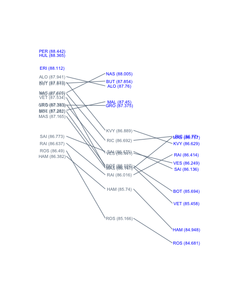
If we use a time based y-axis, we can see a couple more things. Firstly, how the cars are grouped in terms of time, perhaps revealing something about qualifying strategy and doing "just enough"? Secondly, whether improvement was made in laptime going from one qualifying session to the next: lines that slope
upwards left to right show a deterioration in laptime. If you imagine replacing an upward sloping line with a horizontal line it shows you where a driver would have qualified had he repeated his earlier, better laptime.
The problem with using the vertical laptime axis is that there is a high likelihood of labels colliding. The
directlabels R package provides several utilities for managing label layout - I wonder whether the
apply.method function could be used to adjust the label positions so that they can be clearly read. In the chart below, symbols are used to depict exactly the actual laptimes on a real number scale; in the above chart, the line endpoints arguably perform a similar role?
And this is how the times from Q3 compared in a time-grid layout:


No comments:
Post a Comment
There seem to be a few issues with posting comments. I think you need to preview your comment before you can submit it... Any problems, send me a message on twitter: @psychemedia