Is this any more meaningful? One thing I think it's lacking is a radial divider to separate out the sessions? (Not sure hwo to do that yet!)
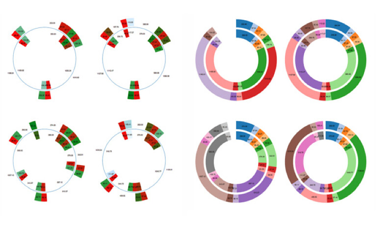
Here's a side by side comparison with the previous style:
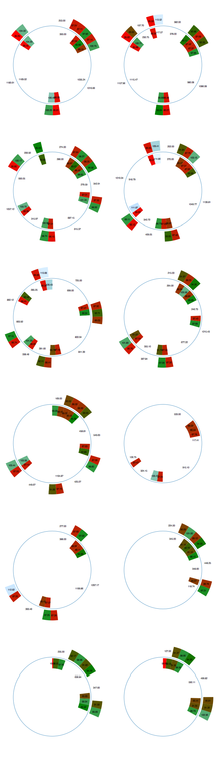
The Protovis color mapping I'm using is dependent on laptime. The values I used were guessed at, so I need to come up with a principled way of setting them. It may also be worth experimenting with a log scale:
.fillStyle(pv.Scale.linear(85,95,110).range('red', 'green', 'lightblue'))
I don't know if "lightblue" is a valid colour, (maybe it's breaking something....!) but I got the effect I wanted!
I added the thin blue boundary to provide a means to pull together the data from the two drivers into a meaningful whole. This also acts as a prompt to me to look in more detail at the Gestalt Theory of Visual Perception...
Hmm... the problem with the different arc lengths now jumps out and distorts the comparison of lap times between drivers in the same team... Unless you hold your breath and let colour dominate your perception as to which is faster.
ReplyDeleteOne way round this might be to introduce white space between laps in the outer circle, and scale back the chord length for the outer segments as as if they were in the inner circle?
I like the chart. I took me sometime to figure out how to read it but it has a lot of information. Is there anywhere available the tire used to run each of the segments before going back to pits? I believe this will show some good info about them. Not sure if a mark can be added to show what was used. I guess we know for the Q3 drivers what was used a the last segment. If I udnerstand the rule it should be the same that they start the race. Is this correct?
ReplyDelete@Armando Yes, I've been thinking that it would make sense to be able to display the tyre choice type, maybe as an inner or outer label for each driver in the short term?
ReplyDeleteAs to where to get the data - I don't know anywhere that does publish this realtime (or even post hoc for practice/qualifying; Pirelli post info about the tyres used in the race). It may be we can work out a crowd-sourced solution via an F1 blog such as Sidepodcast (I need to talk to Mr C about the possibility of this;-)
One thing on my to-do list is to start segmenting the data into different stints across practice/qualifying/race and by by tyre to see if I can work out a signature for the tyres based on lap times over the stint. This is bound to be crude but may provide one way of auto-detecting a tyre type with a certainty value associated with it just from the timing data? I used to do machine learning type stuff, so this might provide an interesting return to some of those techniques for me ;-)