Continuing the series of posts trying to get a handle on whether or not we can get an idea of how teams improved (or not) over the course of the season based on normalised sector times, here are a couple of charts where I took the best sector time per race per team, normalised against the mean of the best sector times per team per race.
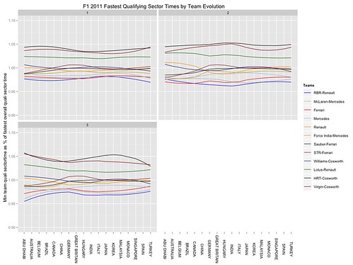
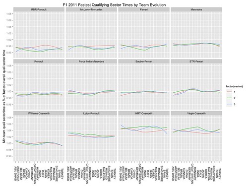
The intention of this approach is to try to get away from any biases in the improvement cycle imposed by the times set by the fastest team in each sector that was implicit in the charts in the previous posts. But does this approach make sense? And do the charts reveal anything useful?
No comments:
Post a Comment
There seem to be a few issues with posting comments. I think you need to preview your comment before you can submit it... Any problems, send me a message on twitter: @psychemedia