This first chart aims to summarise the classification at the end of each of the three practice sessions and qualifying. I find it a bit hard to make any sense of? What position did Maldonado qualify in, for example, or where was WEB classified in P2?
Here's another take - does the tabulation offer more than the graphical view?

The next chart summarises positions at the end of each session in qualifying. There are two major considerations here - do we order results Q1, Q2, Q3 or Q3, Q2, Q1? And how do we order the drivers? In this configuration, I have drivers arranged by their classification at the end of Q1, ranked with first at the top and 24th at the bottom. I also need to work on a colour and line style palette.
The same chart as above, minus the lines. This contrasts with the way that the results are traditionally tabulated (one row per driver, ordered by overall classification, first at the top, 24th at the bottom).
In the next chart, I reintroduce the lines, order sessions Q3, Q2, Q1, and rank the drivers according to overall final qualifying classification. I have the Car Number column as a reference point; another reference point might be current ranking in the driver championship?
As above, but top-to-bottom and left-to-right orderings are reversed. (Should I plot the other 2 orderings so we can just see how they look/feel?)
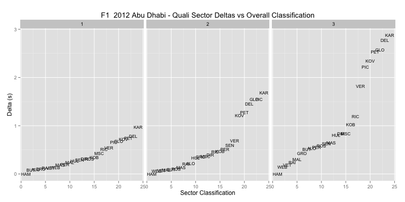
Sector times are also available - here we compare the sector delta (time away from best sector time) against classification in that sector (the title of this chart is incorrect: it should say 'Sector classification" not "Overall Classification"). There's not a lot of slack in sector 1, sector 2 differentiates out the weaker teams, sector three also splits out the midfield teams. I think these sector split charts might make more sense if we look at a circuit map and get a feel for what sort of challenge each sector offers?
Compare speeds to overall qualifying classification - we see that MAL is fast in a straight line and that web and VET are slow. Note we could flip the y-axis, and maybe also label it as a speed delta away from the fastest speed? Would that be useful? In this chart do you get the raw feeling that HAM is faster or slower than WEB and VET?
The classification ranking is one thing, but it doesn't give us a feeling for how speed translates to laptime or laptime deltas between the cars? In this next chart, we use ultimate laptime on the x-axis, and see clear separation between the bottom teams and the rest of the field. We also see consistency between WEB and VET and ALO and MAS. Do you get the raw feeling that ALO is faster or slower than MAS (ALO was slower,,,)?
This chart looks rather more directly at laptime, comparing ultimate with best achieved laptimes. The distance away from the grey line, and the colour, indicates how far off ultimate the best time was. If we flip the axes, best laptimes slower than ultimate will appear above the line, which is a more natural way of looking at it, maybe?
How do laptime deltas in each sector compare to overall classification (title needs correcting)? There's a bit more going in in these charts, but how easy is it to tell what?
The following stacked bar chart orders drivers by overall qualifying classification, and then shows their delta from the best recorded sector time overall:
In the next chart, we order cars by driver number (a common baseline); it might also make sense to annotate this chart with team identifiers?
How overall classification compares to rank in each sector. Above the line and sector rank is better than overall rank. Below the line, sector rank is worse than overall classification. So WEB is fast in sector 1, PER is slow in sector 2 and fast in sector 3. Would this chart be easier to read if axes were flipped? That is, below the line showing a driver is faster/better ranked in a sector than their overall classification would suggest?
A simple chart plotting speed versus driver in driver number order. We see team consistency in the main...
Does speed appear to translate to an advantage in any particular sector? If we plot speed vs. sector delta, what does it show?


No comments:
Post a Comment
There seem to be a few issues with posting comments. I think you need to preview your comment before you can submit it... Any problems, send me a message on twitter: @psychemedia