The following chart tries to provide an overview of key position related information from across the race as a whole. In particular, it identifies:
- grid positions;
- race positions at the end of the first lap;
- final race positions (before any changes by the stewards);
- the range of race positions taken by each driver throughout the race.
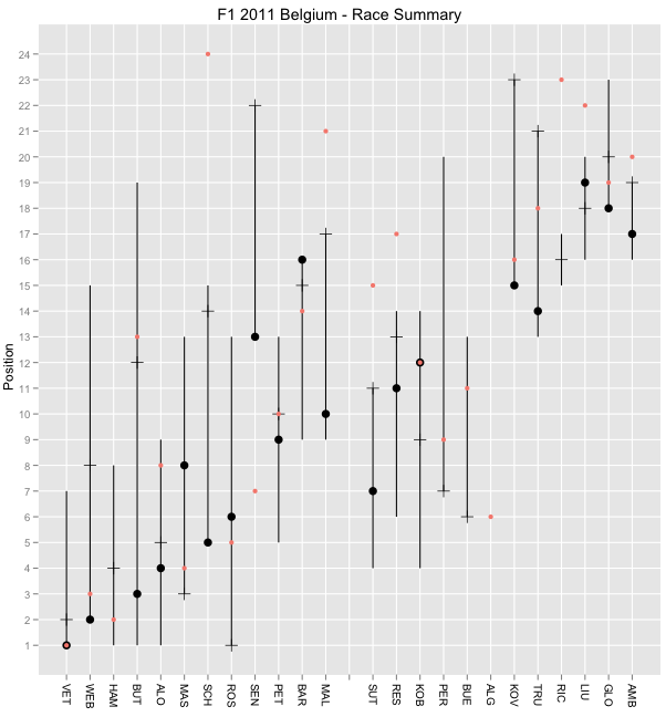
Key:
- red dot: grid position;
- black dot: final position
- horizontal tick mark: position at end of first lap
- vertical line: range of race positions
The chart was constructed with a view to providing journalists with a snapshot overview of the race as an aid to intifying which drivers might have an an "interesting" race: blog.ouseful.info/2011/08/03/data-driven-storytelling-wor...
So:
- what sorts of information can you pull out of this chart (please let me know in the comments...;-) For example, we can see Senna had a lousy start, Button's race went all over the place, Schumacher had an amazing start, (and Ricciardo fared quite well at the start too, as did Rosberg), and five cars did not finish (five missing black dots).
- how can the chart be improved?
PS Any ideas on new and "interesting" ways of displaying information about the pit stop activity?
No comments:
Post a Comment
There seem to be a few issues with posting comments. I think you need to preview your comment before you can submit it... Any problems, send me a message on twitter: @psychemedia