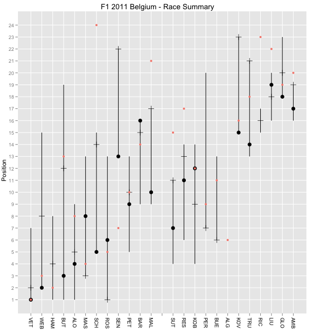
Anyway, here's a couple of quick charts - a race summary chart:
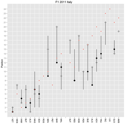
(Red dot: grid position; black dot - final position; plus/horizontal tick mark - position at end of lap 1; vertical line - range of positions held during race.)
I saw the chart before looking at any f the data (I missed the race and all news about it). First impression from race summary chart - what on earth happened on the first lap?
And from the laptimes heat map:
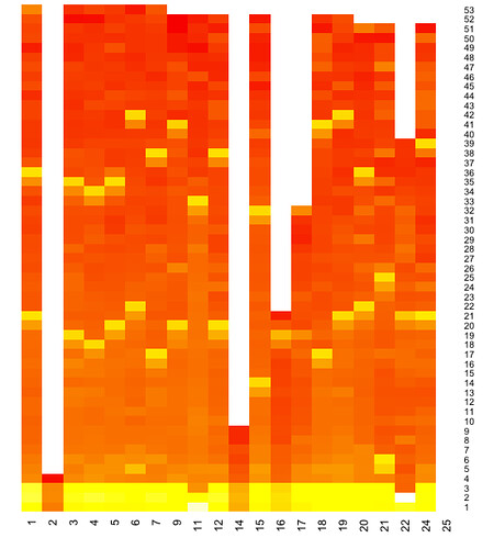
Did the safety car come straight out?!
Note Webber's time in particular raises possible issues with the colouring I use on the heat map; his times were similar to everyone else's but he never got his times down to the times everyone who completed the race did. The chart shows this (sort of); but would it be better if the heat reflected the overall laptime (rather than - as it currently does - the log difference between each driver's lap time and his fastest lap?)
Here's what the heatmap function I use in R comes up with if I just plot the raw laptime:
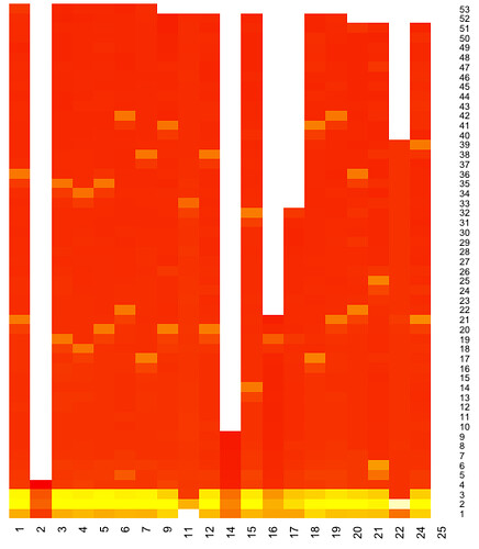
This clearly shows the safety car coming out for the second and third laps. I think I need to get a better feel for how the heat map colouring works, and see if I can come up with better within column, or cross column, colour ranges? (It'd also be nice to be able to overplot purple laps?)