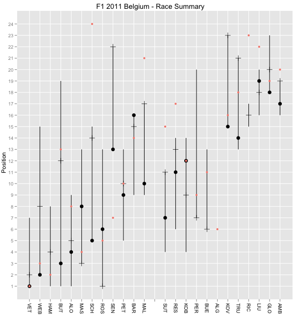
Here's the sort of thing I mean:
This is a visualisation of times recorded during the Belgian grand prix (can you see when the safety car came out?)
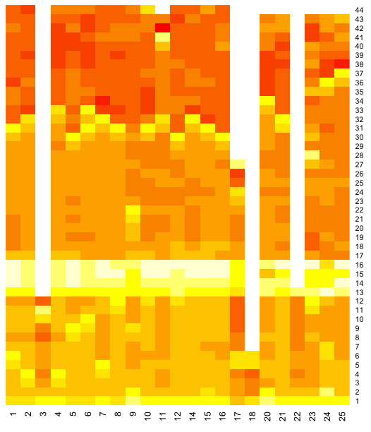
The chart is defined as follows: x axis is driver/car number; y axis is lap; the data that is visualised by the "heat" of each of block is the difference between the laptime and the fastest laptime recorded by that driver during the race. Bright red shows a small gap between the current laptime and that driver's fastest lap. (In fact, I use a logarithmic mapping from delta to colour value.)
If we look for the deep reds, those are laps that were close to that driver's fastest lap. Note that there is plenty of scope for visual illusions - car 11 appears to have a red much brighter than any other driver in lap 42... But each car has a lap that red (the driver's fastest lap, when the delta to their fasted lap is 0). For an example of just such an illusion, see Adelson Checker Shadow Illusion (h/t Mr C/@sidepodcast)
Here's the R script I used to generate the heatmap. It pulls the data from the Google spreadsheet I set up to store timing data from the race.
#Grab the data from a Google spreadsheet
library(RCurl)
gsqAPI = function(key,query,gid=0){ return( read.csv( paste( sep="",'http://spreadsheets.google.com/tq?', 'tqx=out:csv','&tq=', curlEscape(query), '&key=', key, '&gid=', curlEscape(gid) ) ) ) }
beldata=gsqAPI('0AmbQbL4Lrd61dDBfNEFqX1BGVDk0Mm1MNXFRUnBLNXc','select C,D,E',gid='9')
l2=with(beldata, data.frame(car=car,lap=lap,laptime=lapTime))
#Now we're going to reshape the data and then plot it
library(graphics)
library(plyr)
library(reshape)
#this function is just to keep things tidy
#It could be refactored to accommodate more parameters, eg col, scale
f1djHeatmap=function(d){
lx=cast(d, lap ~ car, value=c("diff"))
lx=lx[-1]
lm=data.matrix(lx)
lh=heatmap(lm, Rowv=NA, Colv=NA, col = heat.colors(256), scale="column", margins=c(5,10))
}
#reshape the data
dd<- ddply(l2, .(car), summarize, lap=lap, diff=log(1+laptime-min(laptime)))
#plot the heatmap
f1djHeatmap(dd)
Here's a view over the fuel corrected laptimes:
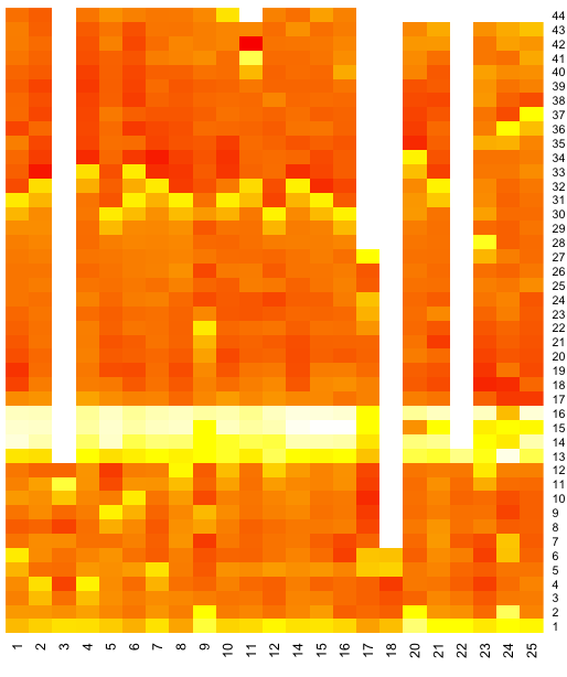
This looks more textured to me...if the fuel penalty model is sound, then maybe it shows some deterioration in times due to tyre wear.....?
Here's how it was generated:
beldata=gsqAPI('0AmbQbL4Lrd61dDBfNEFqX1BGVDk0Mm1MNXFRUnBLNXc','select C,D,F',gid='9')
l2=with(beldata, data.frame(car=car,lap=lap,laptime=fuelCorrectedLaptime))
dd<- ddply(l2, .(car), summarize, lap=lap, diff=log(1+laptime-min(laptime))) f1djHeatmap(dd)
If you can find better ways of doing the colour mapping, or scaling the data, please let me know in the comments.
I also wonder whether a heat map showing position held by each car at the end of each lap in the race would be informative?
PS if you want to try out R, I suggest using RStudio.