Here's the sort of thing I mean:
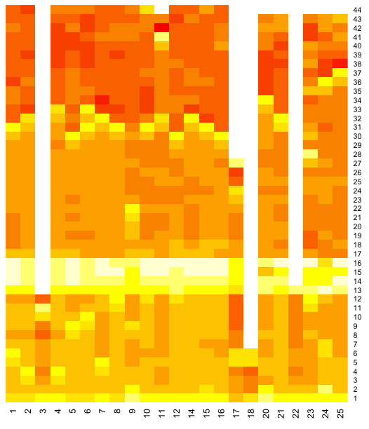
This is a visualisation of times recorded during the Belgian grand prix (can you see when the safety car came out?)
The chart is defined as follows: x axis is driver/car number; y axis is lap; the data that is visualised by the "heat" of each of block is the difference between the laptime and the fastest laptime recorded by that driver during the race. Bright red shows a small gap between the current laptime and that driver's fastest lap. (In fact, I use a logarithmic mapping from delta to colour value.)
If we look for the deep reds, those are laps that were close to that driver's fastest lap. Note that there is plenty of scope for visual illusions - car 11 appears to have a red much brighter than any other driver in lap 42... But each car has a lap that red (the driver's fastest lap, when the delta to their fasted lap is 0). For an example of just such an illusion, see Adelson Checker Shadow Illusion (h/t Mr C/@sidepodcast)
Here's the R script I used to generate the heatmap. It pulls the data from the Google spreadsheet I set up to store timing data from the race.
#Grab the data from a Google spreadsheet
library(RCurl)
gsqAPI = function(key,query,gid=0){ return( read.csv( paste( sep="",'http://spreadsheets.google.com/tq?', 'tqx=out:csv','&tq=', curlEscape(query), '&key=', key, '&gid=', curlEscape(gid) ) ) ) }
beldata=gsqAPI('0AmbQbL4Lrd61dDBfNEFqX1BGVDk0Mm1MNXFRUnBLNXc','select C,D,E',gid='9')
l2=with(beldata, data.frame(car=car,lap=lap,laptime=lapTime))
#Now we're going to reshape the data and then plot it
library(graphics)
library(plyr)
library(reshape)
#this function is just to keep things tidy
#It could be refactored to accommodate more parameters, eg col, scale
f1djHeatmap=function(d){
lx=cast(d, lap ~ car, value=c("diff"))
lx=lx[-1]
lm=data.matrix(lx)
lh=heatmap(lm, Rowv=NA, Colv=NA, col = heat.colors(256), scale="column", margins=c(5,10))
}
#reshape the data
dd<- ddply(l2, .(car), summarize, lap=lap, diff=log(1+laptime-min(laptime)))
#plot the heatmap
f1djHeatmap(dd)
Here's a view over the fuel corrected laptimes:
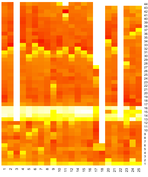
This looks more textured to me...if the fuel penalty model is sound, then maybe it shows some deterioration in times due to tyre wear.....?
Here's how it was generated:
beldata=gsqAPI('0AmbQbL4Lrd61dDBfNEFqX1BGVDk0Mm1MNXFRUnBLNXc','select C,D,F',gid='9')
l2=with(beldata, data.frame(car=car,lap=lap,laptime=fuelCorrectedLaptime))
dd<- ddply(l2, .(car), summarize, lap=lap, diff=log(1+laptime-min(laptime))) f1djHeatmap(dd)
If you can find better ways of doing the colour mapping, or scaling the data, please let me know in the comments.
I also wonder whether a heat map showing position held by each car at the end of each lap in the race would be informative?
PS if you want to try out R, I suggest using RStudio.
Great work Tony!
ReplyDeleteWe've sometimes use a similar technique to get a better idea of lap times. Here is an old example I did using Excel and its "conditional formatting". A pretty nifty way of getting results quickly.
http://www.optimumg.com/techtip/race2010.png
Interesting - thanks for the link...
ReplyDeleteThe two major issues I have with my chart are the colour palette/colour range and the illusory optical effects.
I used a log scale to try to account for the order 1-2s range in laptime compared to the order 15-20s differences caused by the pits, but I'm not sure how well this works. (I maybe need to look at the distribution of laptimes and then try to apply rules to apply different scales/palettes, but I'm not sure how to achieve that atm (I'm finding R really challenging - and am becoming rather reliant on Stack Overflow!)
If I can suss out how to do heatmap layers, one thing I think I'd like to try is marking purple laps.
The optical illusion effects present another challenge. Maybe there are colour mappings that can mitigate this effect?
Do you have any examples of how the heat map has provided any insights, either during a race, or in post hoc analysis?
Also on my to do list is to use a heat map to chart deltas between a driver's own laps, both applied to raw times and fuel corrected times; (again, it may be necessary to range the colour mapping to take into account the normal running regime and the in/out pit stop laps, as well as safety car laps). I thought I'd found an R function to calculate this (diff()), but I don't think it likes the NA values in cells where no lap time is available...
This whole visualisation thing is a real voyage of discovery for me, so I'll keep on hunting!
This is very nice. In light of your new chart, may I show you something I've done simply wit excel?
ReplyDeleteBelow is something I've compiled from the recent German GP
http://img856.imageshack.us/img856/4617/rnd10rysis.gif
@double eyepatch - that's interesting: an intra-cell bar chart. Have you posted the formula you used to create that effect anywhere?
ReplyDelete@double eyepatch PS out of interest, where did you get the timing data/how did you get the data into Excel? I run a series of Python scrapers over the FIA F1 timing press release PDFs to extract the data...
ReplyDeleteThe timing data is also from the FIA timing press PDFs you obtain. However I don't use any scripts to import the data into excel, I just copy/paste each drivers lap times into columns and parse the table into different stages to get what I need to produce that table. There's plenty of manual stages in my methods and at this stage I'm trying to make a macro to make the whole thing easier, but my programmings lacking a bit.
ReplyDeleteHave a play around with my Belgian GP data if you like.
http://www.mediafire.com/?6ftxptgvm6w4n9m
@double eyepatch My scripts are all automated; I post the data I scrape into spreadsheet form on Google spreadsheets (linked from http://f1datajunkie.blogspot.com/p/data.html ) - feel free to make use of it... and let me know if I can put it into any more useful form.
ReplyDelete