How did the drivers compare within a team in each sector (comparing sector best times for each driver captured across all three qualifying sessions)? A greeny-blue bar to the left shows "driver1" in a team got a better time than "driver 2". A reddy-orange bar to the right shows "driver 2" did better:

This chart helps us see how the drivers compared to their team mate, but it doesn't really tell us anything about overall competitiveness?
If we rank by final classification, how do laptimes across qualifying sessions compare, and how do they compare to the ultimate laptime for each driver (the sum of their fastest sector times)? It seems that if VET had driven an ultimate lap, he might have made second?

Another intra-team comparison chart - the view over all the panels gives us some idea of the competitiveness of each team. I wonder whether adding lines at y=10.5 and y=17.5 to show cut off for each session would be useful?


The following stacked bar chart makes it easy to see how the overall performance differences per driver by sector compared to the fastest time recorded in each sector:

The ordering by driver helps us find driver's by car number.
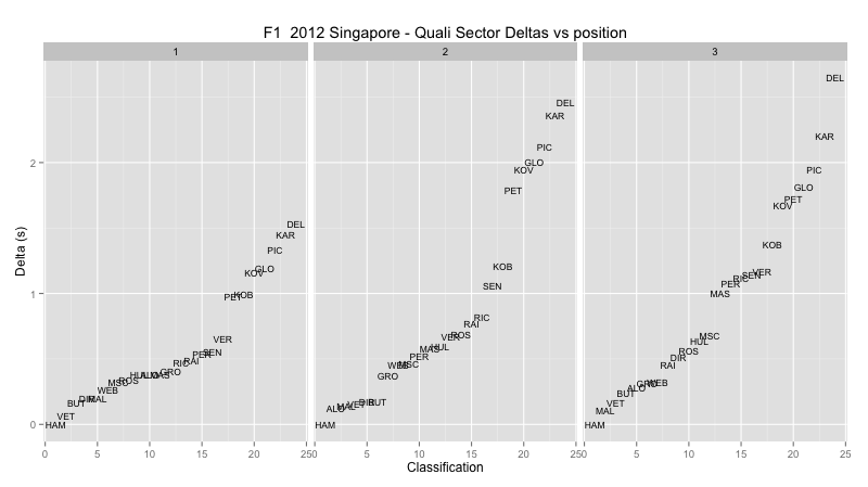
An alternative ordering shows the stacked bars by final classification. There's something odd going on here - MAS and RAI are inverted and the classification order is different to the classification ordered ultimate laptimes chart above? Bah..... I was going to say this is a really handy chart, because it lets us compare sector times (ish) between drivers next to each other in classification terms. But with the inversion in ordering, I can't trust what data is there:-( Ho hum... back to the scripts... I guess this suggests I should really do incremental commentary as I produce each chart so I can check they are all consistent as I go along... [SPOTTED IT... I'm using the wrong ranking... Will fix .....] - DONE.
This chart is handy for a couple of reasons. Firstly, it lets us compare sector times (ish) between drivers next to each other in classification terms; secondly, where columns appear inverted (eg as in case of MAL and VET), it shows us that VET, in this case, had an ultimate laptime that would have bumped him up the order, if he could have driven to it...


No comments:
Post a Comment
There seem to be a few issues with posting comments. I think you need to preview your comment before you can submit it... Any problems, send me a message on twitter: @psychemedia