Have data, will play...
I've been exploring a little more around what's quick and easily achieved using the statistical programming language R (via
RStudio. (Don't let the phrase "statistical programming langage" put you offer. With a few simple commands you can generate all manner of complicated graphs and charts without having to know any stats at all!)
The data (in the text based CSV format) is available for download from here:
FP1 data,
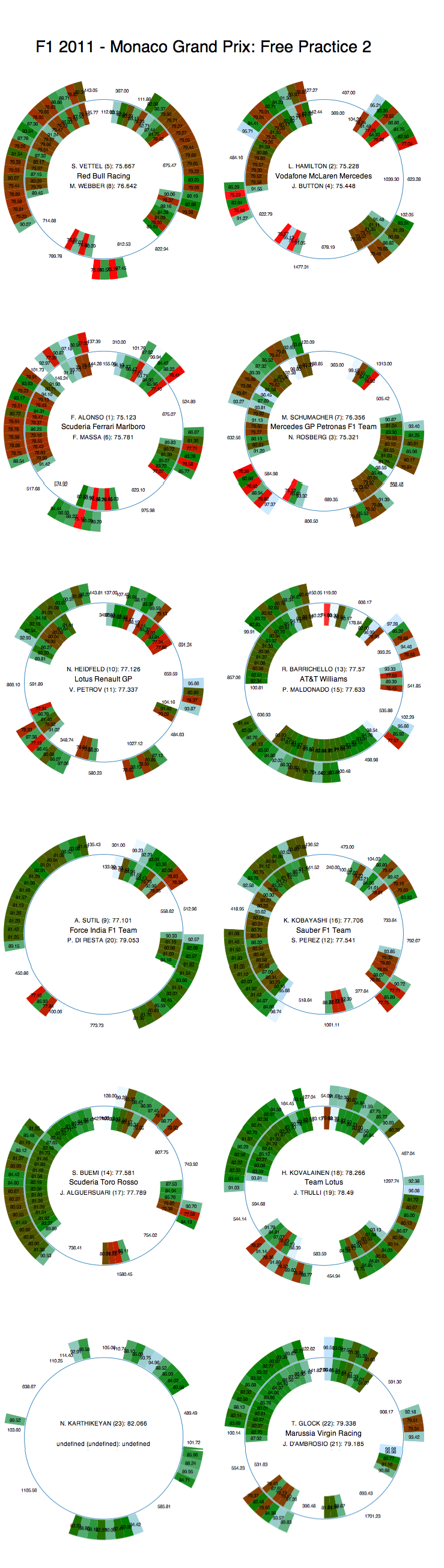
FP2 data
You can download and save these files from my Google spreadsheet archive of the Monaco data by right-clicking on the link and choosing "Save Link As..." or something similar. I saved the files as
mco_2001fp1laptimes.csv and
mco_2001fp1laptimes.csv respectively.
In Rstudio, you can now load in the data using the
Import Dataset option.
(Loading direct from the CSV URL doesn't seem to work for me...)
The datasets I uploaded to Google spreadsheets include things like each laptime in the practice session, the stint (and lap number in the stint), the elapsed time during the session at the end of each lap and the fuel corrected laptime (relative to the stint)
Here's how we can plot how the teams used the session - the following command says "for each driver, plot the elapsed time at which they finished each lap using the FP1 data)":
plot (DriverNum ~ Elapsed,data=mco_2011p1laptimes)
(The
Export option in the Chart window allows you to easily save the chart as an image file.)
If we want to plot session 1 and session 2 data on the same chart, we can generate a combined data set. (Both datasets have exactly the same column headings.) Before we do that though, we want to be able to identify the data from free practice 1 and free practice 2 in the combined dataset. We can do that by adding a new column to each dataset within R (it will leave the actual CSV file untouched) that specifies the practice session:
mco_2011p1laptimes$fpsession<-1
mco_2011p12aptimes$fpsession<-2
Here, the first command says: for dataset mco_2011p1laptimes, add a column ($)
fpsession and set the value of each cell in that column to
1.
Now we can concatenate the two datasets (
rbind, which maybe means "row bind"?) into a single dataset (
bothfp), whilst still being able to reference each sessions times directly via the
fpsession column.
bothfp=rbind(mco_2011p1laptimes,mco_2011p2laptimes)
We can now plot data from both practice sessions on the the same chart using the following command:
plot (DriverNum ~ Elapsed, col=fpsession,pch=Stint,data=bothfp)
This reads as "plot a scatterplot (
plot) for each DriverNum against Elapsed time, colouring the points by the session number (
col=fpsession) and using symbols that represent which stint in the session the driver was on (
pch=Stint):
We should really add a title too, using the
main parameter:
plot (DriverNum ~ Elapsed, col=fpsession,pch=Stint,data=bothfp,main="F1 2011 Monaco: Free Practice 1 and 2 Session Utilisation")
Alternatively, we could have added the title using the command:
par(ps=10)
title(main="F1 2011 Monaco: Free Practice 1 and 2 Session Utilisation")
Here,
par(ps=10) says: first set the parameter
ps (font size) to 10, then print the title.
Seeing how the teams used the session is one thing, but how about the laptime distribution within a session? The following command shows the laptimes across the second session as a whole by driver:
plot (Time ~ DriverNum, data=mco_2011p2laptimes)
If we want to look at the distributions of laptimes by driver, we can plot the "density" of laptimes according to driver (this is a bit like a histogram, but it uses a continuous line to display the distribution of the laptimes).
d3=subset(mco_2011p2laptimes,DriverNum==3)
plot (density(d1$Time))
(Another way of writing the above would be
plot (density(Time),subset(mco_2011p2laptimes,DriverNum==3)). Can you see how they achieve the same thing?)
If we include the
lattice package in out set up (which may need installing via
Packages/Install Packages), we can plot multiple kernel density plots on the same chart. Here's a comparison the in-stint fuel corrected laptimes between Hamilton and Vettel:
require(lattice)
densityplot(~Fuel.Corrected.Laptime, groups=DriverNum, data=subset(mco_2011p2laptimes,DriverNum==1 | DriverNum==3),main="F1 2011 Monaco - FP2: VET vs HAM")
(This really needs a legend to identify each driver.)
At first glance, this is quite appealing, but on second thoughts I wonder if a histogram wouldn't actually reveal more? For example, if you look closely, you see that there Hamilton's laptimes may also be split into two main clusters, as Vettel's are, although this distinction is masked by the smoothed density plot? Hmm...
Note that we can also use the lattice to plot a separate distribution plot for each driver:
densityplot(~fuelCorrectedLaptime|DriverNum,data=mco_2011p2laptimes)
(In this case, I need to work out how to label each chart; note that there is a visual indicator of each DriverNum in each celll title bar. Hint: VET is the bottom left chart.)
Okay - enough for now. What I wanted to start exploring was some of the charting tools in R that might make a visual comparison of laptimes from practice possible at a glance. The kernel density plot for comparing laptime distributions between two drivers looks like it could be really handy, though at times maybe misleading in a way that a histogram wouldn't be..? Along the way, I also learned how to add a column to a dataset and concatenate two separate datasets into a single one.:-)