Showing posts with label freepractice3. Show all posts

Saturday, November 24, 2012

F1 2012 Brazil Third Practice Summary

A quick visual summary of P3 at the 2012 Brazilian Formula One Grand Prix...

Here are the deltas between best lap time and ultimate laptime (so who's not driving to the limit?;-):


The ultimate vs. personal best laptime chart shows similar information in an alternative form - the further away form the line, the further off the ultimate lap:


How does each driver fare by sector? 

We can also compare sectors separately:
Or like this....


Deltas again...


If we compare sector rankings with overall classifications, we can get a feel for drivers who are particularly quick - or slow - in a sector; something goes wrong for WEB in sector 3, but GRO is good in 2 and DIR in 3? ALO's losing in sector 1?


How do deltas compare by sector against sector classification?


How do the deltas compare in each sector (delta from fastes sector time)? Again, lets order by overall classification so we can see folk who are out of sorts:


By the by, how do speeds compare?


And sector rank v straightline speed?

Sector delta v speed?

Saturday, November 17, 2012

F1 2012 United States Grand Prix Third Practice Summary

Sketches around P3 of the 2012 Formula One United States Grand Prix...

First, how to the deltas for each driver's best sector time compared to the best overall sector time stack up? Drivers are ranked by session classification, so we see that Button is out of position. WHilst he pulled in some good sector times, presumably he couldn't hook them up together?
If we look at the delta between best lap time and ultimate laptime, we should therefore see that BUT is way off...
...as indeed he is..

If we look at the ultimate vs. personal best laptime, we should see BUT out of postion - we can get a feel for the ultimate laptime ranking by look at how drivers are ordered along the y-axis:
 This is a little cluttered - let's zoom in:
Now we see that if drivers drove their ultimate laps, BUT would have moved up three positions.

How does each driver fare by sector? 

If we order by driver number, we can get a feel for how each driver fared as well as team behaviour:

One thing that jumps out for me in this chart is how much time can be lost in sector 2? The Red Bulls seem to be nailing it in sector 3 compared to everyone else?

If we compare sector rankings with overall classifications, we can get a feel for drivers who are particularly quick - or slow - in a sector:
So in sector 1, GRO is fast, and HUL slow. BUT is up in sector, wheres WEB is down. In sector 3, WEB picks up places, as does RAI, but MAL seems to be slow?

How do the deltas compare in each sector (delta from fastes sector time)? Again, lets order by overall classification so we can see folk who are out of sorts:
So in sector 1, we see HUL is slow and GRO picks up time. Sector 2 is all over the place, but WEB's bad time stands out. Similarly, in sector 3 we see MAL mess up, but RAI makes up time.

If we view the same sort of chart order by sector ranking, we can get a better feel for whether there are any breaks in the team performances, as well as as whether any sectors present any particular problems to any given team (you need to know driver pairings to detect team patterns though...)
Looks like sector 2 spreads them out...

By the by, how do speeds compare?

Red Bulls are *slow*, aren't they?

Does there appear to be any relationship between speed and ultimate laptime?
How about speed and overall classification?

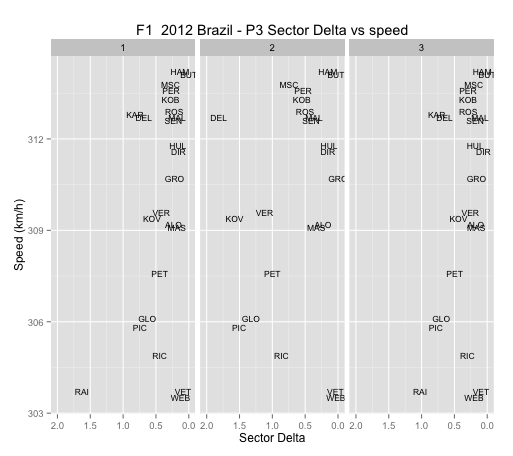
Can we spot any relationships between speed and sector times?
Maybe we'll see something if we group the driver's deltas and plot them against speed?

Hmmm... I'm not convinced I can easily spot any patterns there...? Thought I'm not totally sure what to look for... (That is, this view may not be meaningful at all;-)


Saturday, September 22, 2012

F1 2012 Singapore P3 Comparisons

Time differences between each driver's best sector times in third practice compared to the best overall sector time:
Comparing deltas compared to best overall sector time with sector based classification:
Summed deltas from best overall sector times:

Another comparison of sector times deltas compared to the best overall sector time:
Speed trap comparison:

Intra-team sector delta to best overal sector time comparisons:
Differences between personal classified time and team ultimate laptime:
(I need to check the code on this one - eg we could imagine the fatset ultimate comparing the ultimate lap of each driver in the team, or we might imagine constructing an artificial ultimate team lap based on the best sector time recorded in each team for each sector.)
Here's how the drivers compare within a team - the size of the bar gives the differences between the sector times of drivers within the same team. If the bar goes to the left, "driver 1" has gone faster than "driver 2".


Saturday, June 9, 2012

F1 2012 Canada FP 3

A quick couple of charts summarising third practice.

Session utilisation:

Laptimes, by stint and stint lap:

Deltas of laptimes within 1.07 of fastest laptime from fastest laptime:

(I really need to colour the different stints better, or use symbols to identify stints and reserve colours for eg personal best laptime to date, purple to date? Also need to start thinking about where I can get tyre info per stint, and how to represent that? Current charts show how improvements are made over a session, but it would be even better if we could distinguish within stint improvement from between stint improvement?)

See also: F1 2012 Canada FP1 & FP2

Saturday, October 15, 2011

F1 2011 Korea FP3 and Qualifying

Here's how the teams made use of FP3:


And here's how their speeds/times compared in qualifying:

Saturday, September 24, 2011

F1 2011 SIngapore Free Practice 3

Here's a round of activity during third practice at the 2011 Singapore Formula One Grand Prix.

Here's how the teams and drivers made use of the session:


Here's a summary of the overall times recorded by each driver, and how those times were distributed:


As mentioned in previous posts, these figures can be misleading, as the cars may have different set-ups during each stint of the race. To get a better feeling for how the cars responded to each setup, we need to do a breakdown by stint.

For example, here's how the times for Red Bull, McLaren and Ferrari compare:


This are all over the place - maybe I need to filter out lap times above 120s and replot to show something a little more indicative of actual pace?


To see charts for the other teams, check out the F1DataJunkie 2011 SIngapore Grand Prix Gallery