Showing posts with label freepractice1. Show all posts

Saturday, June 9, 2012

F1 2012 Canada FP1 & FP2

Summary charts from the first and second free practice sessions from the Canada Formula One Grand Prix.

Session utilisation chart for first practice:

Lap times per stint by car in FP1 (long stints, 8 or more laps)

Session utilisation chart for second practice:


Lap times per stint by car in FP2 (long stints, 8 or more laps):

Lap times per stint by car in FP2 (zoom in on long stint, fast laps):

Scatter plot showing relative position of each car at the end of each session (FP1: x, FP2: y)

(It would probably make sense to swap the axes, then you can read from left to right to see who did best in FP2, and compare with the FP1 position by reading up the chart?)

Scatter plot showing fastest laptimes per car across sessions (FP1: x, FP2: y)

(I really need to use the same limits on the axes, and also plot an x=y line so we can see the extent to which times were improved, or not, across sessions.)

Scatter plot showing number of laps run per car across sessions (FP1: x, FP2: y)

Source code used to generate the charts available from CloudStat: F1 Practice Reports

Friday, April 20, 2012

F1 2012 Practice Session 1 Laptimes

Friday, October 14, 2011

F1 2011 Korea FP1 and FP2 Session Utilisation

Here's how the teams made use of Free Practice 1 and Free Practice 2 during the 2011 Korean Grand Prix race weekend:


Friday, September 23, 2011

F1 2011 Singapore Free Practice 1

Here's a quick visual summary of activity from FP1.

Session Utilisation by car - how the teams made use of the practice session:


The x-axis is the elapsed time during the session. For each driver (by car number), we plot roughly when they were out on track. The gaps in the chart suggest that all the cars were in the pits at the same time on a couple of occasions. In this case, that was for a couple of red flag incidents.

Laptime distribution over the session, by car:


I don't think the distribution summary on the right is particularly useful, because each car might have several stints with a different setup in each stint...

Maybe more useful is to look at how the times are distributed by stint within a team:


Hmmm... the boxplot is not that useful when it summarises just a couple of data poins, but maybe these two charts do work together?

I've also started playing with the dexy.it documentation framework, looking to see how I could use it to automate the generation of statistical charts like the above from the timing data using the R statistical programming language. The scripts are still a work in progress, but with a few more tweaks I should be able to generate charts like the above, and for each team in the case of the team charts, at the click of a button...

Friday, June 24, 2011

F1 2011 European Grand Prix/Valencia - First Practice

A quick view over FP1 for the 2011 Valencia Formula One European Grand Prix (data linked to from the Data page).


[Columns sortable by clicking on headers]

Firstly, lap times:


A close-up of the fastest laptimes:


With fuel penalty accounted for in the laptime (ish!):


And here's a breakdown of when the cars went out on track:


See also:
F1 Valencia - Circuit Preview Based on 2010 Race Telemetry

Thursday, May 26, 2011

F1 2011 Monaco Free Practice 1 - Utilisation

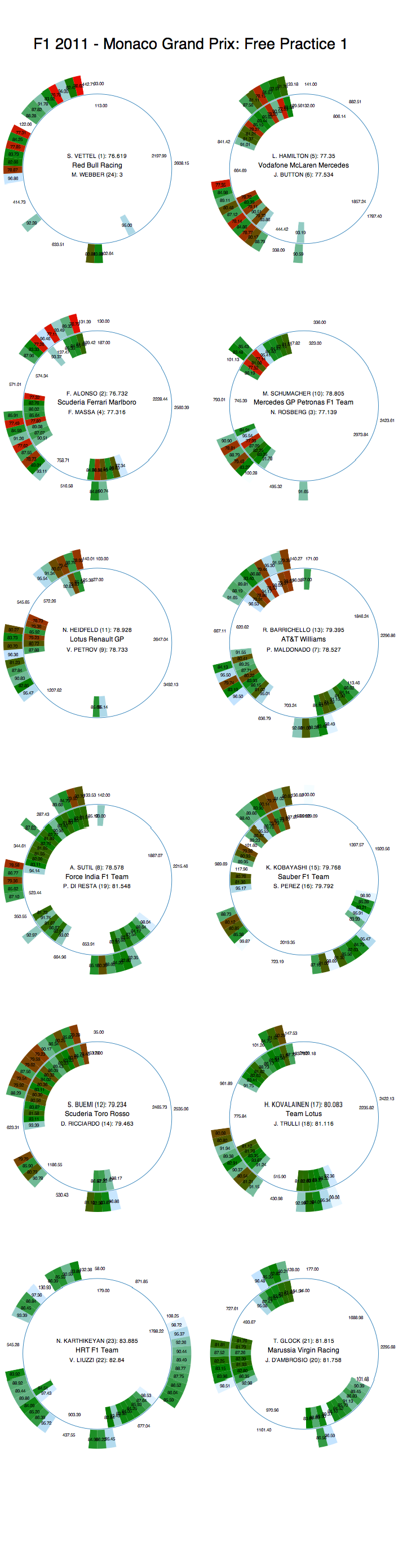
Here's how the teams made use of free practice 1 as preparation for the 2011 Monaco Formula One Grand Prix:

f12011mcofp1donut

Seems like Webber didn't have such a good time of it?

If you want to have a play with the data yourself, here it is: F1 Monaco 2011 FP1 timing data

Saturday, May 21, 2011

F1 2011 Spain Free Practice - Laptime Distributions

A visual summary of laptime distributions

(Note that laptimes exceeding 1.5 times the time of a driver's fastest lap are not shown.)


The R commands used to generate these images are of the form:

plot(Time ~ DriverNum,data=esp_2011p3laptimes, main='F1 2011 - Spain: Free Practice 3',xlab="Car",ylab="Laptime (s)")

and

boxplot(Time ~ DriverNum,data=esp_2011p3laptimes, main='F1 2011 - Spain: Free Practice 3',xlab="Car",ylab="Laptime (s)")

PS here's a better R recipe for plotting charts with driver name labels:

//set font size
par(ps=15)
plot(Time ~ DriverNum,data=esp_2011p3laptimes, main='F1 2011 - Spain: Free Practice 3',xlab="Driver",ylab="Laptime (s)",xaxt='n')
labels=c("VET","WEB","HAM","BUT","ALO","MAS","SCH","ROS","HEI","PET","BAR","MAL","","SUT","RES","KOB","PER","BUE","ALG","TRU","KOV","KAR","LIU","GLO","AMB")
//set font size
par(ps=10)
text(1:25,par("usr")[3],srt=90,adj=1,labels=labels,xpd=TRUE)

Friday, May 20, 2011

F1 2011 Spain Free Practice 1 - Utilisation

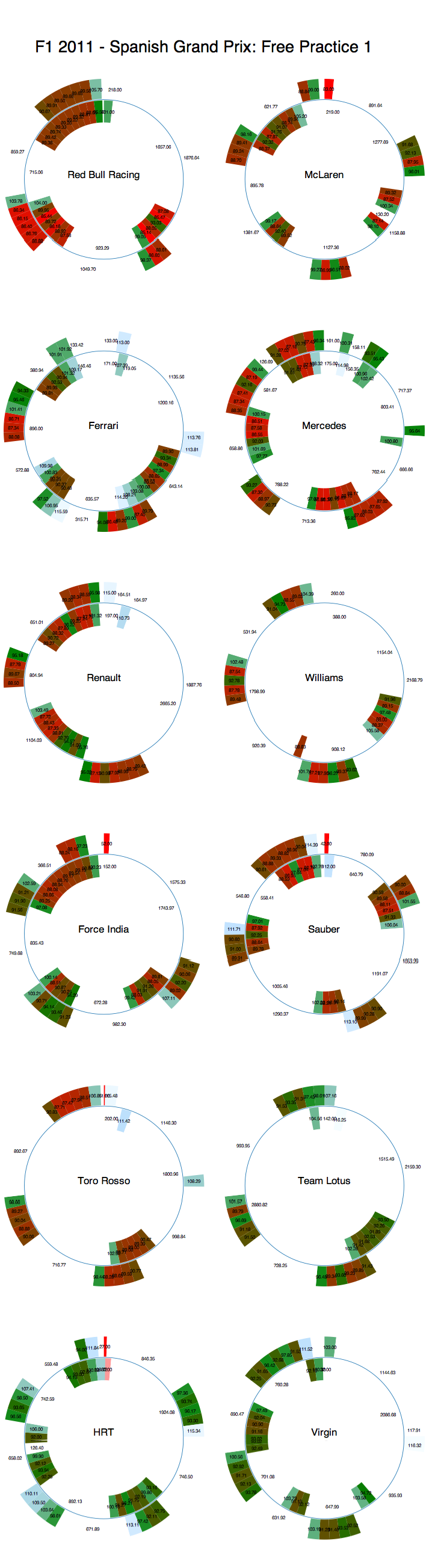
A quick overview of how the teams made use of Free Practice 1. Session time progresses round the donut with a start time corresponding to the earliest time recorded on the timing sheet, and the end time corresponding to the time the final recorded time. Each team's graphic shows the activity of both drivers, with driver 1 on the outside and driver 2 on the inside. Segments get hotter/redder the faster they are (I need to find out how to suppress the colour in the first segment - the time to emergence (that is, the time in seconds the car appeared after the appearance of the first car on the timing sheet).

F1 2011 SPain Free Practice 1 utilisation


A quick glimpse over the chart as a whole show the Red Bulls appear to be in good form, along with Massa and maybe even the Mercedes?

Friday, May 6, 2011

F1 2011 Turkey Free Practice 1 - Times

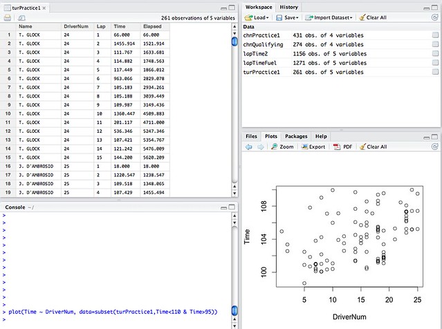
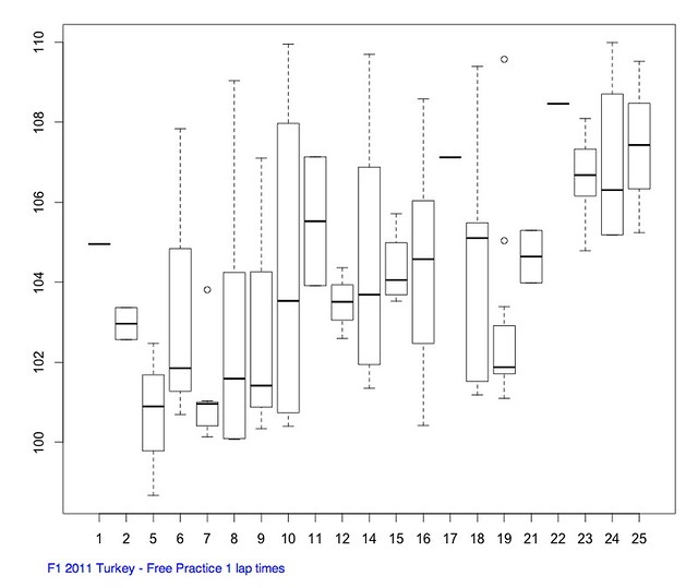
A summary of laptime distributions for each driver and each team during free practice 1 using data from the timing sheet provided via the FIA media centre. (Note that some timings may correspond to in or out laps; slow laps/long pits stop times have been filtered out).

Firstly, a scatterplot showing lap times by driver:

F1 Turkey 2011 practice 1 lap times


Secondly, a box and whiskers plot showing the broad distribution of times per driver:

F1 2011 Turkey - Free practice 1 lap time distribution


[Generated using RStudio]

F1 2011 Turkey First Free Practice - Utilisation

A macroscopic view of how each driver and each team utilised free practice 1 using data from the timing sheet provided via the FIA media centre:

f1tur2011fp1donut

(THe originally posted image contained a scaling error and has been replaced by the updated image shown above.)

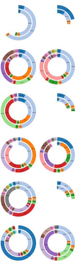
Each pair of rings represents one team. The outer ring is the lower numbered driver. The teams are order from left to right, going down the page (so top left is Red Bull, top right is McLaren).

360 degrees corresponds to the largest elapsed session time measured from F1 timing sheets from across the drivers.

Each segment represents a different time recorded lap on the FIA timing sheet. The angular distance, and hence length of the segment, represents time.