Showing posts with label f1tur2011. Show all posts

Thursday, May 19, 2011

F1 2011 Turkey Race - Times By Stint, and the Race As it Appeared on Track

This is the last of the posts on the Turkey race, as I try to commission a couple more chart types ready for this coming weekend's race.

First up, I had a dabble with the new Pivot table facility in Google Spreadsheets to create a couple of charts showing the laps in each stint by driver, and the duration of each stint (howto: Reshaping Your Data – Pivot Tables in Google Spreadsheets ). Here are the times by stint:


This is obviously just a quick sketch, but it gives an idea of a chart type around this data view.

The second thing I've been looking at is a variant of the race history chart in which we plot the time between each driver and the lead car on track, rather than the overall time to the leader:


Again, this is just a rough sketch, but it does have a few nice features. Can you spot, for example:
a) when the lead car pits?
b) when a car is lapped?
c) when a car unlaps itself?

I'm going to try to formalise the features describing these events (they're all visible in the above chart...) as part of an automated race review commentary generator... hopefully... err.. maybe...;-)

The gnuplot command I used for the "race as it appeared on track" chart was of the form:
set term x11
set datafile separator ","
plot srcfile using ($2=='1'?$5:1/0):(-$4) w l,srcfile using ($2=='2' ? $5:1/0):(-$4) w l,srcfile using ($2=='3' ? $5:1/0):(-$4) w l,srcfile using ($2=='4' ? $5:1/0):(-$4) w l, srcfile using ($2=='5' ? $5:1/0):(-$4) w l,srcfile using ($2=='5' ? $5:1/0):(-$4) w l,srcfile using ($2=='7' ? $5:1/0):(-$4) w l,srcfile using ($2=='8' ? $5:1/0):(-$4) w l,srcfile using ($2=='9'?$5:1/0):(-$4) w l,srcfile using ($2=='10' ? $5:1/0):(-$4) w l,srcfile using ($2=='11' ? $5:1/0):(-$4) w l,srcfile using ($2=='12' ? $5:1/0):(-$4) w l, srcfile using ($2=='14' ? $5:1/0):(-$4) w l,srcfile using ($2=='15' ? $5:1/0):(-$4) w l,srcfile using ($2=='16' ? $5:1/0):(-$4) w l,srcfile using ($2=='17' ? $5:1/0):(-$4) w l,srcfile using ($2=='18'?$5:1/0):(-$4) w l,srcfile using ($2=='19' ? $5:1/0):(-$4) w l,srcfile using ($2=='20' ? $5:1/0):(-$4) w l,srcfile using ($2=='21' ? $5:1/0):(-$4) w l, srcfile using ($2=='22' ? $5:1/0):(-$4) w l,srcfile using ($2=='23' ? $5:1/0):(-$4) w l,srcfile using ($2=='24' ? $5:1/0):(-$4) w l,srcfile using ($2=='25' ? $5:1/0):(-$4) w l

Monday, May 16, 2011

F1 2011 Turkey Race - Elapsed Time Difference Chart With any Car Origin

One of the issues that has come up looking at the Battle Maps (proximity charts?) is that it's difficult to tell which cars a driver is battling with, or indeed identify any of the other cars to see whether they are passed e.g. in a close battle situation with cars in front and behind.

One chart that will show that is a modification of the race history/elapsed time difference chart where the origin is the car of interest, and the times for other cars are plotted as elapsed time of focus car - elapsed time of other car. Below is the elapsed time delta map for HAM:


Note that when HAM pits, we get a sudden increase (move up the chart/positive y-direction) in the delta for most of the other cars. When another car pits, there is a large move down the chart (negative y direction) for that car's trace. We can explicitly add grid lines to the graph to highlight when HAM pits:


We can also modify the axes to zoom in on a the close fought action:


Note however that these charts don't show the on-track position of backmarkers which were displayed on the battle map.

The data for generating these charts can be found here. An example gnuplot command for generating the chart is as follows:

gnuplot> set term x11
//My mac doesn't display anything with the aqua setting?
gnuplot> set datafile separator ","
//my data file is CSV, so define the separator, just in case...
focusCar=4 //this is actually the column number in the Elapsed Time file, *not* the driver number
srcfile='tur_2011elapsedtimes.csv'
set grid noxtics x2tics noytics
set xrange [1:70]
set x2range [1:70]
set yrange [-50:50]
set x2tics ("" 9,"" 20,""34,"" 46)
plot srcfile using ($1):(column(focusCar) -$2) with lines title "VET",srcfile using ($1):(column(focusCar) -$3) with lines title "WEB",srcfile using ($1):(column(focusCar) -$4) with lines title "HAM",srcfile using ($1):(column(focusCar) -$5) with lines title "BUT",srcfile using ($1):(column(focusCar) -$6) with lines title "ALO",srcfile using ($1):(column(focusCar) -$7) with lines title "MAS",srcfile using ($1):(column(focusCar) -$8) with lines title "SCH",srcfile using ($1):(column(focusCar) -$9) with lines title "ROS",srcfile using ($1):(column(focusCar) -$10) with lines title "HEI",srcfile using ($1):(column(focusCar) -$11) with lines title "PET",srcfile using ($1):(column(focusCar) -$12) with lines title "BAR",srcfile using ($1):(column(focusCar) -$13) with lines title "MAL",srcfile using ($1):(column(focusCar) -$14) with lines title "SUT",srcfile using ($1):(column(focusCar) -$15) with lines title "RES",srcfile using ($1):(column(focusCar)-$16) with lines title "KOB",srcfile using ($1):(column(focusCar)-$17) with lines title "PER",srcfile using ($1):(column(focusCar)-$18) with lines title "BUE",srcfile using ($1):(column(focusCar)-$19) with lines title "ALG",srcfile using ($1):(column(focusCar)-$20) with lines title "TRU",srcfile using ($1):(column(focusCar)-$21) with lines title "KOV",srcfile using ($1):(column(focusCar)-$22) with lines title "KAR",srcfile using ($1):(column(focusCar)-$23) with lines title "LIU",srcfile using ($1):(column(focusCar)-$24) with lines title "GLO",srcfile using ($1):(column(focusCar)-$25) with lines title "AMB"


(Hmm... can I force gnuplot to use column headers as titles, somehow, rather than explicitly setting them?)

Note the use of the gnuplot column() command to allow us to set as a parameter which car we want to set as the focus car/car at the origin.

Sunday, May 15, 2011

F1 2011 Turkey Race - Battle Maps

One of the challenges for race viewers arising from this year's seemingly non-stop round of pit stops is knowing who's in what race position at any given time given that the position of cars on track may be all over the place.

One of the chart styles I've been experimenting with tries to capture information about the distance to the cars in front of, and behind, a given car in both race position terms and positions on the track.

Here's one view, showing Hamilton's race:


And here's another, with the actual race position of the focus car overlaid on the diagram:


Here's a view over Button's race:


Without me providing any commentary, for now, about these charts, what information can you get from them? Can you spot where the driver is closing in on the car in the race position ahead? Can you spot where a car is in danger of being passed by a car catching up from behind?

Please let me know in the comments, then I'll post my own commentary...

PS here's the data for this chart, and here's a sample Gnuplot command to create a map like the above:

gnuplot> set term x11
//My mac doesn't display anything with the aqua setting?
gnuplot> set datafile separator ","
//my data file is CSV, so define the separator, just in case...
set driver =3
plot "tur_2011proximity.csv" using ($2==driver ? $1:1/0 ):3 with line title "Position","tur_2011proximity.csv" using ($2==driver ? $1:1/0 ):6 lc rgb "purple" title "Car ahead on track","tur_2011proximity.csv" using ($2==driver ? $1:1/0 ):7 lc rgb "magenta" title "Car behind on track","tur_2011proximity.csv" using ($2==driver ? $1:1/0 ):4 lc rgb "blue" title "Car in position ahead","tur_2011proximity.csv" using ($2==driver ? $1:1/0 ):5 lc rgb "red" title "Car in position behind","tur_2011proximity.csv" using ($2==driver ? $1:1/0 ):8 w line title "Pitstops"

Saturday, May 14, 2011

F1 2011 Turkey Race - Fuel Corrected Laptimes By Stint

A couple of days ago, I saw a really nice way of looking at laptime data on the Making up the Numbers blog post on A Great Piece of Fine China. Rather than showing a continuous line for each driver, a break in the line was introduced following each pit stop, a bit like the following:


I made a quick tweak to my code, and produced a new data file grouping times by stint using the heuristic that if there a 12s decrease in laptime then we've probably pitted and have probably got new tyres. (As and when I start to reconcile the data from the different FIA timing data sheets, I'll be able to use the listing of pit stops to do this exactly. But for now, I'm focussing on what I can do with just the timing data, because this could be used as part of a lap-by-lap, realtime visual analysis strategy.) You can find the data here.

Here's an example of a plot showing raw and fuel weight penalty corrected laptimes, by stint, for VET and HAM.


(I guess what might be useful would be to use colour and linestyle dimensions to distinguish between driver and tyre type? So colour for driver and line style (dotted, dashed, etc) for tyres? Or vice versa?)

From the fuel corrected trace, I don't think it's obvious for these drivers which tyre is being used in which stint? Looking over some of the other drivers, there are hints of soft tyres coming on (fuel weight penalty adjusted laptimes coming down just after a pitstop) but nothing conclusive?

For reference, I used the following gnuplot command to generate the above trace, (though I can't help feeling there must be a better way!):

gnuplot> set term x11
//My mac doesn't display anything with the aqua setting?
gnuplot> set datafile separator ","
//my data file is CSV, so define the separator, just in case...
gnuplot> d2n2="HAM fuelcorrected"
gnuplot> d1n2="VET fuelcorrected"
gnuplot> d1n="VET"
gnuplot> d2n="HAM"
gnuplot> driver=1
gnuplot> driver2=3
gnuplot> col1="blue"
gnuplot> col2="magenta"
gnuplot> typ=4
gnuplot> typ2=5
gnuplot> plot 'turdemoHistory-StintLapTimes.csv' using ($3==driver && $1==1? $2:1/0):typ with lines lc rgb col1 title d1n,'turdemoHistory-StintLapTimes.csv' using ($3==driver && $1==2? $2:1/0):typ with lines lc rgb col1 title d1n,'turdemoHistory-StintLapTimes.csv' using ($3==driver && $1==3? $2:1/0):typ with lines lc rgb col1 title d1n,'turdemoHistory-StintLapTimes.csv' using ($3==driver && $1==4? $2:1/0):typ with lines lc rgb col1 title d1n,'turdemoHistory-StintLapTimes.csv' using ($3==driver && $1==5? $2:1/0):typ with lines lc rgb col1 title d1n,'turdemoHistory-StintLapTimes.csv' using ($3==driver2 && $1==1? $2:1/0):typ with lines lc rgb col2 title d2n,'turdemoHistory-StintLapTimes.csv' using ($3==driver2 && $1==2? $2:1/0):typ with lines lc rgb col2 title d2n,'turdemoHistory-StintLapTimes.csv' using ($3==driver2 && $1==3? $2:1/0):typ with lines lc rgb col2 title d2n,'turdemoHistory-StintLapTimes.csv' using ($3==driver2 && $1==4? $2:1/0):typ with lines lc rgb col2 title d2n,'turdemoHistory-StintLapTimes.csv' using ($3==driver2 && $1==5? $2:1/0):typ with lines lc rgb col2 title d1n, 'turdemoHistory-StintLapTimes.csv' using ($3==driver && $1==1? $2:1/0):typ2 with lines lc rgb col1 title d1n2,'turdemoHistory-StintLapTimes.csv' using ($3==driver && $1==2? $2:1/0):typ2 with lines lc rgb col1 title d1n2,'turdemoHistory-StintLapTimes.csv' using ($3==driver && $1==3? $2:1/0):typ2 with lines lc rgb col1 title d1n2,'turdemoHistory-StintLapTimes.csv' using ($3==driver && $1==4? $2:1/0):typ2 with lines lc rgb col1 title d1n2,'turdemoHistory-StintLapTimes.csv' using ($3==driver && $1==5? $2:1/0):typ2 with lines lc rgb col1 title d1n2,'turdemoHistory-StintLapTimes.csv' using ($3==driver2 && $1==1? $2:1/0):typ2 with lines lc rgb col2 title d2n2,'turdemoHistory-StintLapTimes.csv' using ($3==driver2 && $1==2? $2:1/0):typ2 with lines lc rgb col2 title d2n2,'turdemoHistory-StintLapTimes.csv' using ($3==driver2 && $1==3? $2:1/0):typ2 with lines lc rgb col2 title d2n2,'turdemoHistory-StintLapTimes.csv' using ($3==driver2 && $1==4? $2:1/0):typ2 with lines lc rgb col2 title d2n2,'turdemoHistory-StintLapTimes.csv' using ($3==driver2 && $1==5? $2:1/0):typ2 with lines lc rgb col2 title d1n2

Monday, May 9, 2011

F1 2011 Turkey Race - Fuel Corrected Laptimes

When in-race refuelling was still part of the game, calculating fuel strategies was one of the things the F1 amateur strategist could try to play along with. (For a summary of what was involved, see the Royal Academy of Engineering/McLaren worksheet on Formula One Fuel Strategy [PDF].)

Fuel loads still have a part to play now, of course: for every lap travelled, the car uses up fuel, gets lighter, and as a result travels faster (the available kinetic energy has less mass to accelerate around the circuit). Another way of thinking about it is that a fuel weight penalty apples in the form of an increase in laptime for each extra kilogram of mass carried. At the start of a race, when the car is heaviest, a large penalty applies. At the end of the race, when the car is lightest, the penalty is small. If we know how much fuel a car burns per lap, and what the approximate time saving is per unit mass, we can calculate the "fuel corrected" laptimes.

The Williams Turkey preview suggests that the Fuel Consumption round the circuit is 2.7kg / lap with a Fuel Laptime Penalty of 0.3 s / 10kg.

That is: fuelConsumption=2.7, fuelPenalty=0.03, fuelLapsWeightPenalty=mass of fuel * fuelPenalty = (fuelConsumption * laps worth of fuel) * fuelPenalty


We can see how at the start of the race there is a approximately a 4.5 second time penalty due to the weight of the fuel at the start of the race compared to at the end. If we take this time from the laptimes we get a fuel corrected laptime, shown here for VET:


(The label also shows the tyre strategy, as published by Pirellli.)

Note how the unadjusted laptime comes down naturally over the course of the race as the fuel weight penalty is burned off. When we take the fuel weight penalty into account, we get the fuel corrected laptime, which shows an increasing gradient towards the end of each stint as the tyres go off. (It's particulary noticeable in the final stint.) [UPDATE: In a comment, HenningO suggests this final slowing is probably just VET easing off, rather than tyres going off...That's probably right, isn't it?! Doh!]

Another correction we can make is to subtract the fuel corrected fastest laptime for each driver from their laptimes. (That is, take their fastest race lap, caculate the fuel penalty, and subtract that to give a fuel corrected fastest laptime.) If we take this from each laptime, we can see whether the fastest lap was actually the fastest lap (taking into account the fuel penalty).

The lowest fuel and fast lap fuel corrected laptime is actually (fuel weight penalty considered) the fastest lap.

Here are the fuel and fast lap fuel corrected laptimes for HAM, BUT and AMB, all of whom had different tyre strategies:


Note how AMB's soft tyres go off (the corrected laptimes increase towards the end of the corresponding stints), but the hard tyres last well. We also see how BUT's tyres aren't doing him any favours in the final laps of the race.

(Note that the fuel corrected laptime chart could be produced live/during a race from published laptimes, Do any F1 sites publish such a live chart during races?)

Howto make the graphs

The generic fuel penalty chart was plotted using Gnuplot:

gnuplot> set term x11
//My mac doesn't display anything with the aqua setting?
gnuplot> set datafile separator ","
//my data file is CSV, so define the separator, just in case...
gnuplot> set xrange [1:58]
gnuplot> set xlabel "Lap"
gnuplot> set ylabel "Fuel Weight Time Penalty"
gnuplot> plot 0.03*(58-x)*2.7 title "Fuel mass * fuel weight penalty"


The fuel adjusted lap time chart was generated from a CSV file (turlapTimeFuel.csv) of the form:

"Driver,Lap,Lap Time,Fuel Adjusted Laptime,Fuel and fastest lap adjusted laptime
25,1,106.951,102.334,9.73
25,2,99.264,94.728,2.124"


using the following gnuplot command (howto):

plot 'turlapTimeFuel.csv' using ($1==3 ? $2:1/0):5 with lines title "HAM Su | Su(9) Su(20) Hn(34) Hn(46)",'turlapTimeFuel.csv' using ($1==4 ? $2:1/0):5 with lines title "BUT Su | Su(13) Su(26) Hn(39)",'turlapTimeFuel.csv' using ($1==25 ? $2:1/0):5 with lines title "AMB Sn Su(16) Hn(33)"

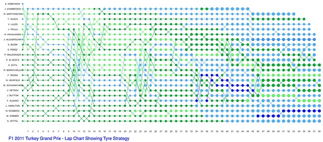
F1 2011 Turkey Race Lap Chart Showing Tyre Strategy

A lap chart showing number of stops (node size) and tyre strategy (node colour):

F1 Turkey Gran Prix - lap chart showing tyre strategy

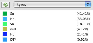
Here's the key (tyre data form Pirelli):

F1 2011 Turkey tyre strategy key

Hu - Hard used, S - Soft used, Hn - Hard new, Sn - Soft new

Saturday, May 7, 2011

F1 2011 Turkey Qualification - Utilisation

Here's the session utilisation chart (about) for qualification, offering a macroscopic view over all three sessions in a single chart.

F1 2011 Turkey Qualifying - Session Utilisation chart

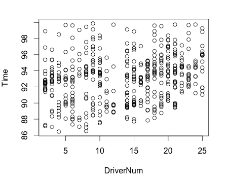
Here's a scatterplot of all the lap times recorded in the session, by driver number, filtered to laptimes between 84 and 104 seconds.


For this to be meaningful, I think need to drop the Pitting laps, and group the laps for a driver, using colour or symbol shape, by stint? Or does anyone have other suggestions?

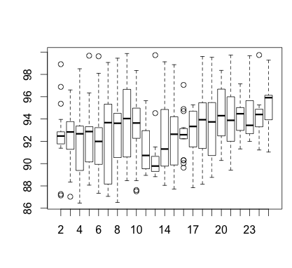
I'm not showing the boxplot - I don't think it's meaningful unless i can find a sensible way of segmenting/filtering the data. In the meantime, maybe a violin plot would work as a stopgap?

F1 2011 Turkey Free Practice 3 - Utilisation

Visual representations of the timing data published via the FIA Media Centre

A macroscopic view of how each driver and each team utilised free practice 3.

f1tur2011fp3donut

(Read more about this visualisation type.)

Here's the distribution of lap times, filter to show times between 80 and 110 seconds in duration:


And the same filtered laptime data as a box plot:


[I maybe need to work out how to rank these in the best time order?]

Friday, May 6, 2011

F1 2011 Turkey Free Practice 2 - Utilisation

Distribution of laptimes (filtered >85s and <100s), as a scatterplot:

F1 2011 FP2 laptimes <100 >85

and as a box plot:

F1 Turkey FP2 - laptime distribution

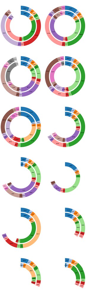
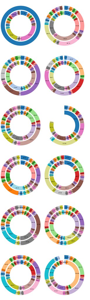
A macroscopic view of how each driver and each team utilised free practice 2 using data from the timing sheet provided via the FIA media centre:

f12011turFP2donut

(Originally posted image was incorrect... this is an updated image)

Each pair of rings represents one team. The outer ring is the lower numbered driver. The teams are order from left to right, going down the page (so top left is Red Bull, top right is McLaren).

360 degrees corresponds to the largest elapsed session time measured from F1 timing sheets from across the drivers.

Each segment represents a different time recorded lap on the FIA timing sheet. The angular distance, and hence length of the segment, represents time.

F1 2011 Turkey Free Practice 1 - Times

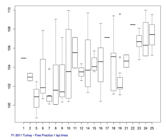
A summary of laptime distributions for each driver and each team during free practice 1 using data from the timing sheet provided via the FIA media centre. (Note that some timings may correspond to in or out laps; slow laps/long pits stop times have been filtered out).

Firstly, a scatterplot showing lap times by driver:

F1 Turkey 2011 practice 1 lap times


Secondly, a box and whiskers plot showing the broad distribution of times per driver:

F1 2011 Turkey - Free practice 1 lap time distribution


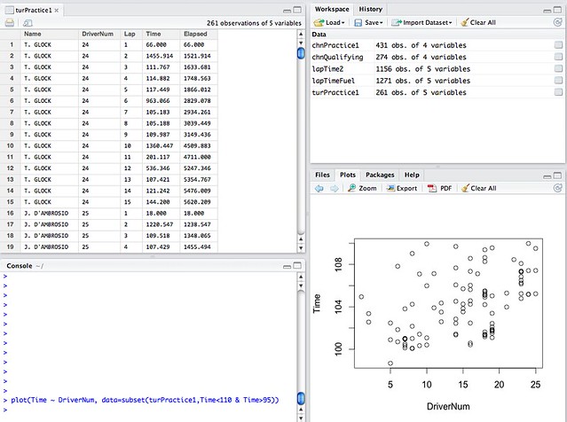
[Generated using RStudio]

F1 2011 Turkey First Free Practice - Utilisation

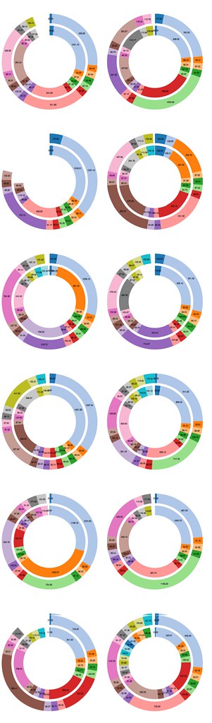
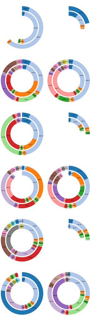
A macroscopic view of how each driver and each team utilised free practice 1 using data from the timing sheet provided via the FIA media centre:

f1tur2011fp1donut

(THe originally posted image contained a scaling error and has been replaced by the updated image shown above.)

Each pair of rings represents one team. The outer ring is the lower numbered driver. The teams are order from left to right, going down the page (so top left is Red Bull, top right is McLaren).

360 degrees corresponds to the largest elapsed session time measured from F1 timing sheets from across the drivers.

Each segment represents a different time recorded lap on the FIA timing sheet. The angular distance, and hence length of the segment, represents time.