Showing posts with label WRC. Show all posts

Tuesday, March 14, 2017

Reading WRC Stage Charts

Over the last few weeks, I've started dabbling with the automated generation of rally reports at a stage level using WRC rally results data. (See examples here.)

Part of the plan is to explore a method for producing simple text based reports based on observations made about various charts of stage split times. So what sorts of chart are in the mix? The following charts are all based on the same stage, but offer different perspectives over it.

The first chart type displays stage split time rank positions. For each driver, record the rank position at each split and at the end of the stage. The drivers are arranged on the horizontal x-axis in order of start position.
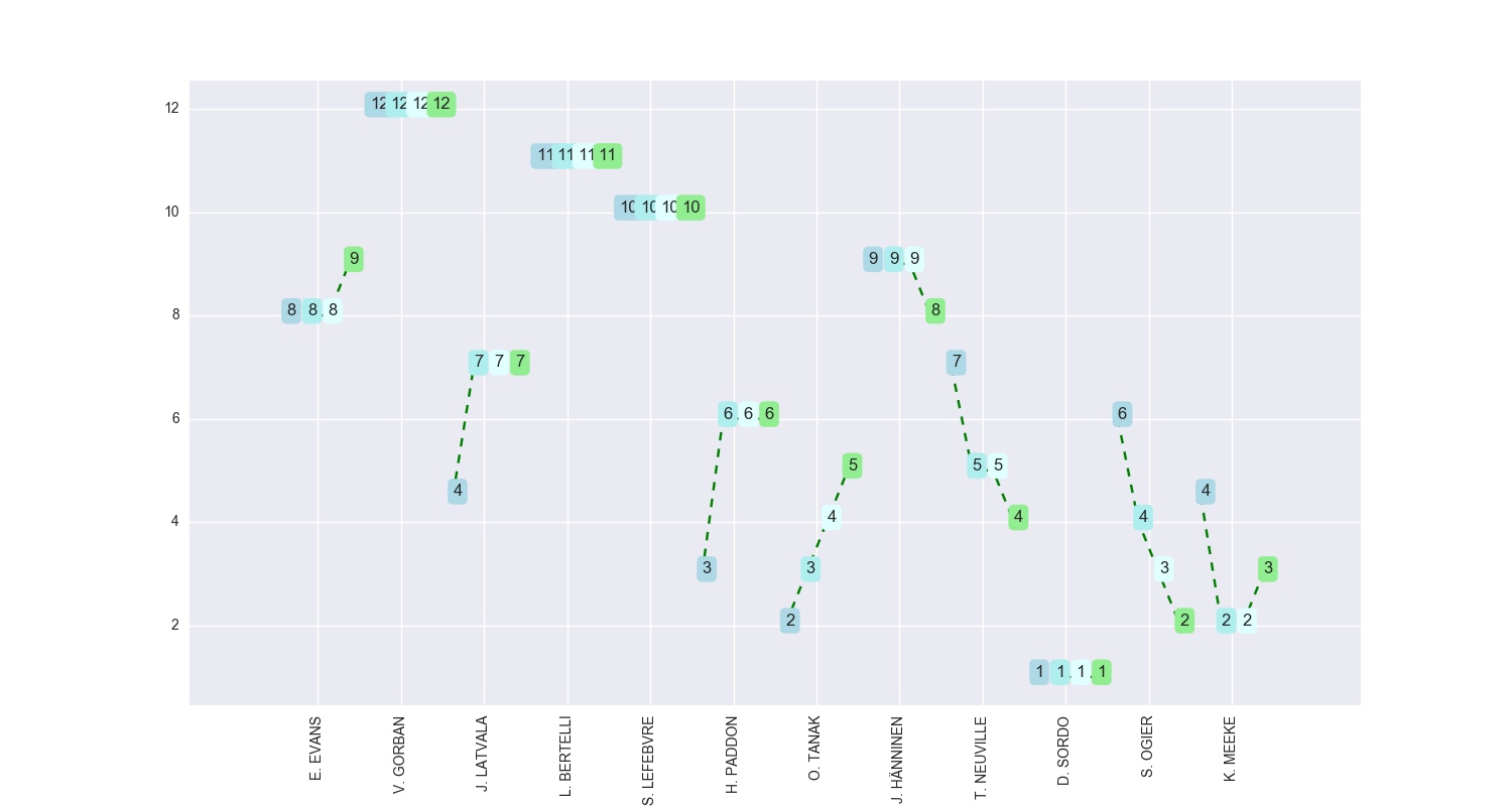
In this first chart, we see how Sordo was ranked first overall at each split point when all drivers' times are considered. (So for example, even though Evans would have ranked first when he passed through each split point, we actually record his ranked positions when the stage is complete and all times are available for ranking purposes.) The line markers represent the position at each split point, with the first split leftmost and the final end-of-stage position rightmost. 

Where the lines for each driver are relatively flat, it shows the driver held position across each split. Where the lines trend down left to right it shows the driver improved their rank position across the stage. Where the lines trend up ad the the right, it shows they lost position over the course of the stage.

The second chart type shows the stage split delta time (in seconds) to the first driver on the stage. For each split, calculate the running stage split time relative to the time recorded by the first driver on the stage. (This means that the first driver will have a stage split delta of 0s at each split and at the end of the stage.)
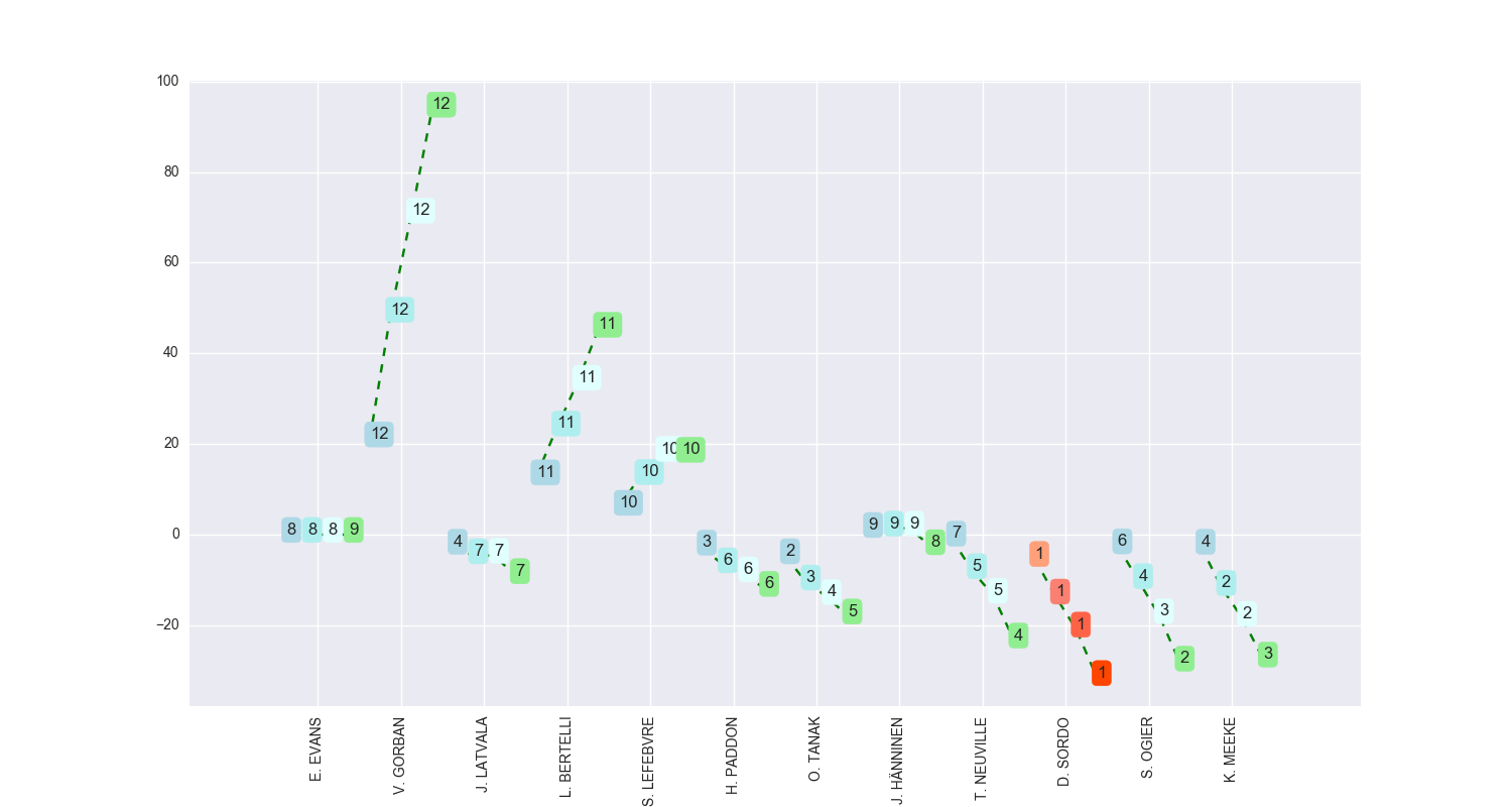

The leader within the stage at each split point is highlighted with the red palette. The labels show the overall rank position at each split.

In this case, horizontal lines show the driver kept pace with the first car (for example, Hanninen), faster with a negative time (vertical y-axis, below the first car, such as Sordo) or slower with a positive time (above the first car, such as Bertelli). Traces moving up and to the right show the driver lost time relative to the first car on the stage. Traces moving down to the right show the driver gained time compared to the first car on stage as they progressed through the stage.

The third chart type shows the stage sector delta time (in seconds) relative to the fastest stage sector time. That is, calculate the "sector time" of each driver (the time between each split point along the stage), find the best (fastest) sector time at each split, and then for each driver find their sector delta from this fastest time. 
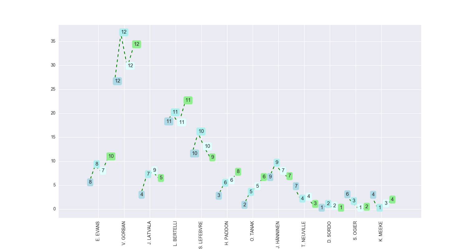
Using this chart, we can get information about how much time each driver gained or lost compared to the driver who got between two split points in the shortest time. The labels show the split sector time rank. In this case, we see that despite being ranked first in terms of overall (accumulated) stage time at each split (the first chart), Sordo does not record the fastest time between splits 1 and 2 (that honour goes to Meeke), or splits 2 and 3 (where Ogier was fastest), although he does record the fastest time going between the start and split 1, and between split 3 and the end of the stage.

The final chart type shows the stage split delta time (in seconds) relative to the overall leader at start of stage. The stage leader is identified as the driver whose split times are all 0s (so Meeke was the rally leader prior to this stage). In the chart below, the driver who was ranked best overall (i.e. in terms of accumulated stage time) at each split is highlighted, although it should be possible instead highlight the driver who was fastest in each sector, or was in the lead of the rally overall prior to the start of the stage.
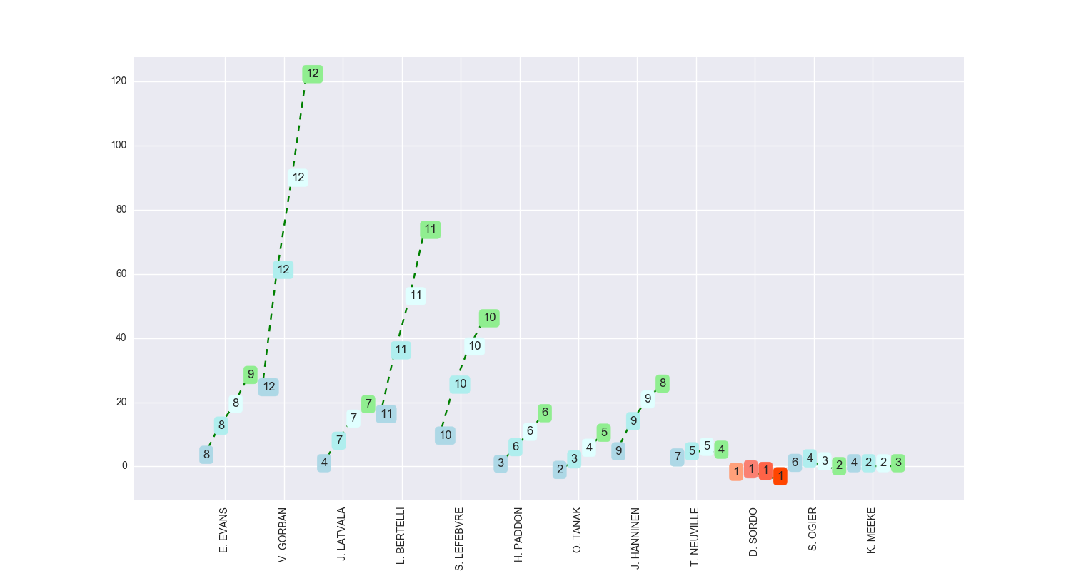
In this case, we see that Sordo made only a slight gain on rally leader Meeke in terms of time, whereas Hanninen lost about 6 seconds to him between each and every split point.

Sunday, January 29, 2017

"Sector Times Deltas" from WRC Rally Stage Split Times

For the longer stages on the WRC rally, one or more split times track the progress of each car through the rally stage. The results record the accumulated stage time of the first car as it passed each timing control, (I'm not sure what is reported if the first car doesn't make it all the way through the stage?), with an offset reported for the cars that follow:


From this information, we can find the accumulated stage time of each car - simply add the offset to the corresponding split time of the first car.

Given the accumulated stage time of a car as it passes each timing control, we can also calculate the time the car spent going between those controls: for two consecutive split times, simply subtract the first split-time from the second. In circuit racing, this would be called a sector time (I'm not sure if rallyspeak uses the same terminology?). Adding up all the sector times recorded by a car should give its stage time.

If for each sector we find the minimum sector time, we can subtract this from the each car's sector time to find the sector time "delta" for that car - the time over the fastest time to complete that sector. (An ultimate stagetime is then given as the sum of the minimum sector times for the stage. A driver could then be said to drive an ultimate stage if his sector times are the fastest in each sector for that stage.)

Just as we could chart split time deltas at stage splits (the times reported in the WRC results shown above), as well as rebased deltas relative to an arbitrary driver, we can also chart the deltas to the minimum sector time for each driver.

The following chart from Stage 3 of the 2017 Monte Carlo rally shows how Ogier was 40s behind the minimum sector time for the first sector, lost a few seconds in the second, but was then on the ball in the latter half of the stage. Evans lost 40s or so in each of the first 3 sectors, and dropped 20s in the last sector. Hanninen was competitive for the first three sectors, but lost time somewhere in the last sector.


(The number labels represent the overall rally ranking (rather than the RC1 relative class ranking shown in the charts in the previous post) based on sector time for that sector. A driver driving an ultimate stage would have position 1 for each sector.)

As well as grouping by driver, we can group by sector. Trends within a sector may show how conditions improved or worsened over the course of the runners. The grouping also highlights drivers who lost time in a particular sector - the number labels in this case represent the car number.

So for example, we see how cars 1, 3 and 20 lost significant amounts of time in sector 1, cars 3 and 30 in sectors 2 and 3, and car 20 in sector 4. Indeed, the last 4 runners in sector 4 all lost more than 15 seconds.

Notes on how to generate these charts will be published at some point...

Saturday, January 28, 2017

Rebasing WRC Stage Split Times - How Elfyn Evans Lost Time on Stage 3 of the Monte Carlo 2017 WRC Rally

As well as visualising split times within a stage relative to the first car passing through the stage (for example, WRC Rally Stage Reports - Split Times (stage 3, Monte Carlo 2017), we can also rebase the split times relative to the times recorded through the stage by any particular driver.

For example, rebasing split times for stage 3 of the Monte Carlo 2017 rally relative to Elfyn Evans' times shows how he lost time relative to everyone except Ogier and Serderidis on the first split, but then continued to lost time at a more or less constant rate over the remaining splits to everyone except Serderidis, who had a spectacularly miserable time.


Note also how this chart is further annotated using colour to highlight the times of a specified driver (which need not be the driver relative to whose times the other drivers' deltas are calculated).

Friday, January 27, 2017

WRC Rally Stage Reports - Split Times (stage 3, Monte Carlo 2017)

I had another tinker with the WRC results/timing data last night, and sketched a chart inspired by seasonal subseries charts that shows the split times and final stage time for each driver in a particular stage.

Drivers are ordered according to the order in which they started the stage. The points within each driver series correspond to the separate split times, in order. The y-axis is the time delta in seconds to the first driver onto the stage, which is why Ogier's times are flat with a delta of 0s at each timing point. The number labels are the in-class rank of the driver at each timing point.

So what can we learn, just from the chart? Firstly, Ogier seemed to lose it at the start. From the Red Bull TV (WRC Rally) coverage (and WRC/FIA footage on Youtube), it seems Ogier went for a little excursion at the start of the stage (stage 3), which accounts for his poor performance there, losing around about 40s compared to the other runners. The trends on Neuville's and Meeke's times are more or less flat, which shows they were approximately keeping time with each other, and with Ogier, across the other checkpoints. Latvala and Breen lost small amounts of time at each split, (the slight upward trend), Lefebvre more so, and Evans and Serderidis big time. Hanninen looked to be making time over the first part of the stage (the downward trend) before losing it on the last part.

Here's another view, rendered using seaborn.

I'll plot a code recipe at some point. Also, I think I'm pretty much committed to trying a Jupyter/python workflow for another data junkie data wrangling book on Leanpub, based around the WRC data...

Wednesday, January 25, 2017

Playing with Python / Pandas - WRC Stage Chart, Monte Carlo 2017

Whilst many of the data sketches I've produced for the F1DataJunkie blog have been generated using R/ggplot2, I spend more of my time now using the Python programming language, and in particular the pandas tabular data wrangling package.

This is partly why my F1 data wrangling tailed off last year. But new year, and all that, so I thought I'd start playing with a new data set, and a new set of charts - around WRC (World Rally Championship) data.

Here's the first sketch I came up with, described (with code) here - a stages chart for the RC1 cars in the 2017 Monte Carlo WRC rally:

This was generated using matplotlib, and shows the overall classification (across all classes) of the RC1 cars at the end of each stage. The boxed numbers showing the ranking of the driver outside the top 12 (there were 12 RC1 cars registered at the start of the rally).